

Lets’ turbocharge customer engagement with strategic design thinking.
Partnering with Lordco, an online retailer for vehicle enthusiasts and parts provided by Spatial Research + Design. I successfully persuaded a thriving e-commerce platform of the benefits of UX enhancement in boosting customer engagement.
My goal was to increase consumer interaction while lowering call center volumes.
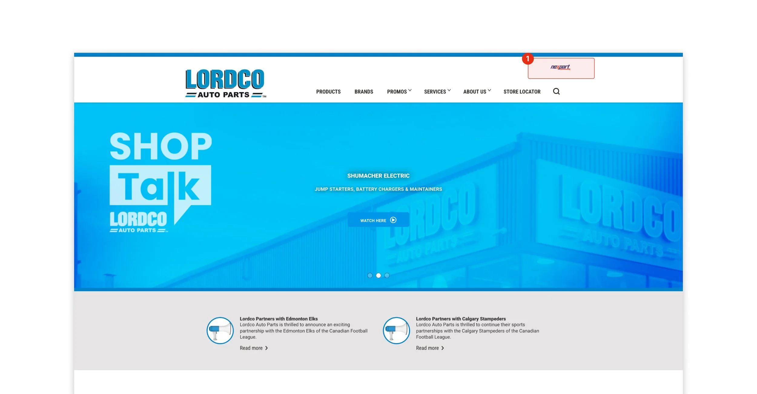
The site is designed to allow car repair professionals and consumers to log in, buy parts, and view articles about the newest items for all makes and models as well as Lordco community involvement.
My role
UX Designer
Timeline
3 months
Team
3 Software Developers
1 Project manager
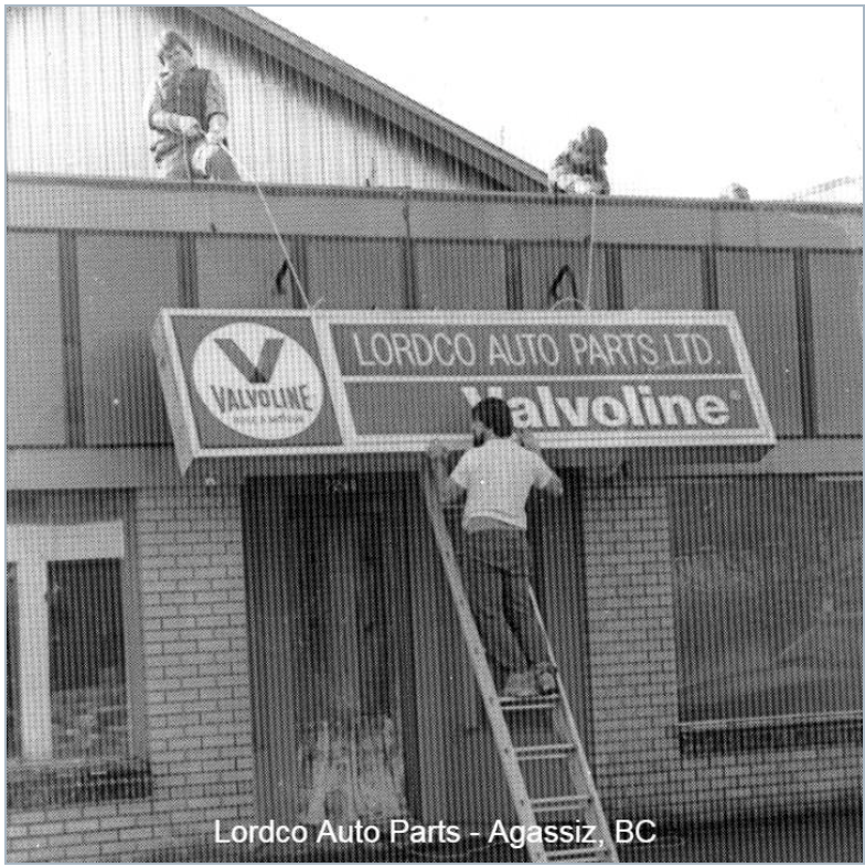
Based in British Columbia, Canada since 1974.
Lordco Auto parts has been a family business in auto parts and has established a reputation with the local community for selling reputable auto parts and offering exceptional customer service.
All in the family
With more than 80 stores, it is the largest privately held distributor of automobile parts in Canada as well as the largest retailer and distributor of aftermarket parts and accessories in Western Canada.
◦ Brand reputation: Nationally recognized in Canada.
◦ Industry: E-commerce
◦ Target markets: Canadian Auto supply
◦ Sector: B2B, B2C and Internal
◦ Business size/type: Corporate
The objective of the project was to ascertain the cause of the high number of complaints and queries that were directed through the call center.
After identifying the issue, I collaborated with the PM & dev team to strategize an engaging experience for the attendees of the auto show.
The company's premier event, the Lordco auto expo, will once again be centered upon an in-person, physical gathering for account clients in 2023. Digital channels will facilitate consumer connection through the Drupal online site.
Problem
1️⃣ New users of the ‘customer account’ portal login were confused on where locating the entry point.
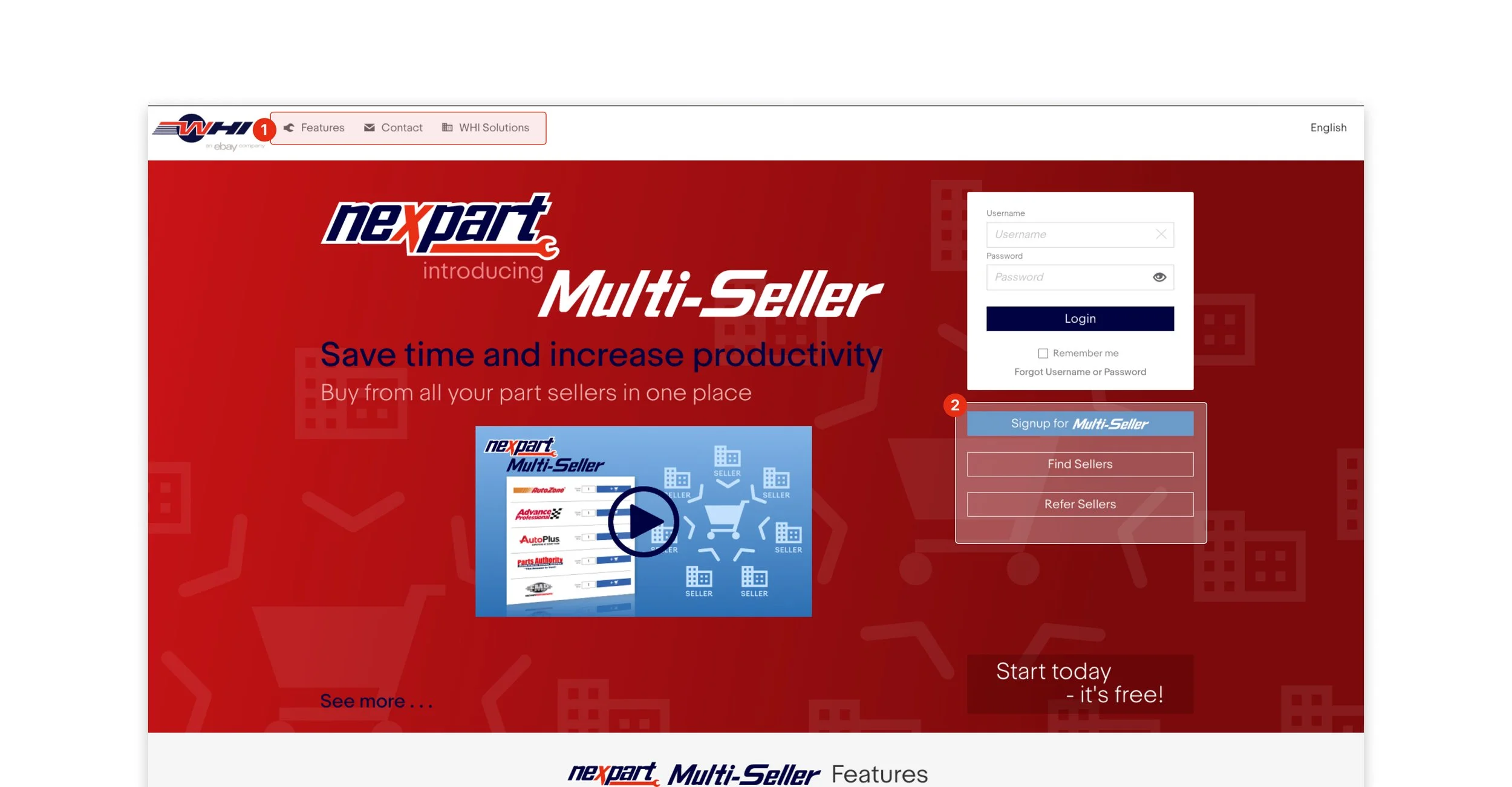
1️⃣ The mechanics were offered multiple sign up paths which confused the initial path for login.
2️⃣ The mechanics/shop owners are offered features not applicable during a login pattern. Should we offer more features this way.
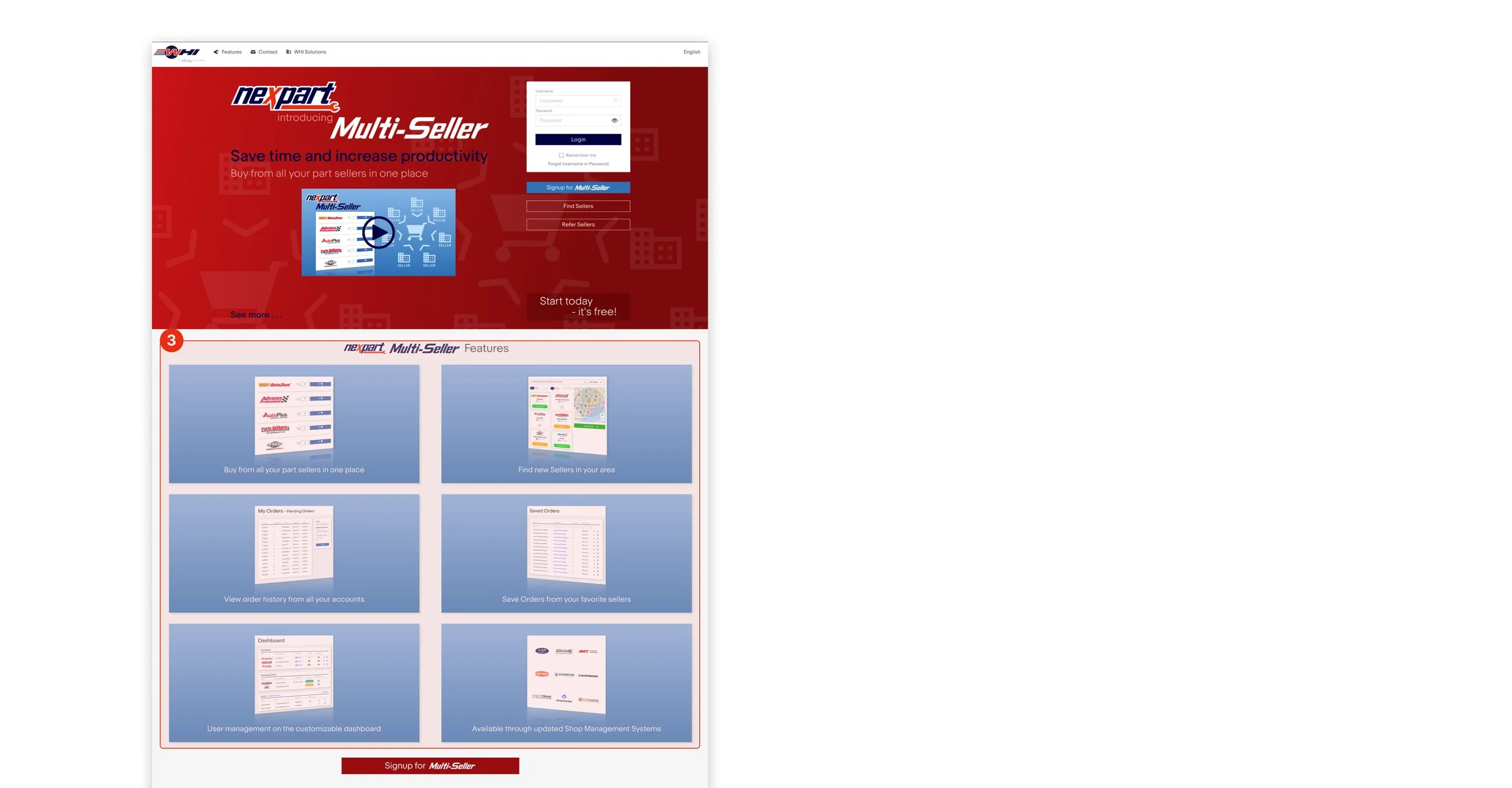
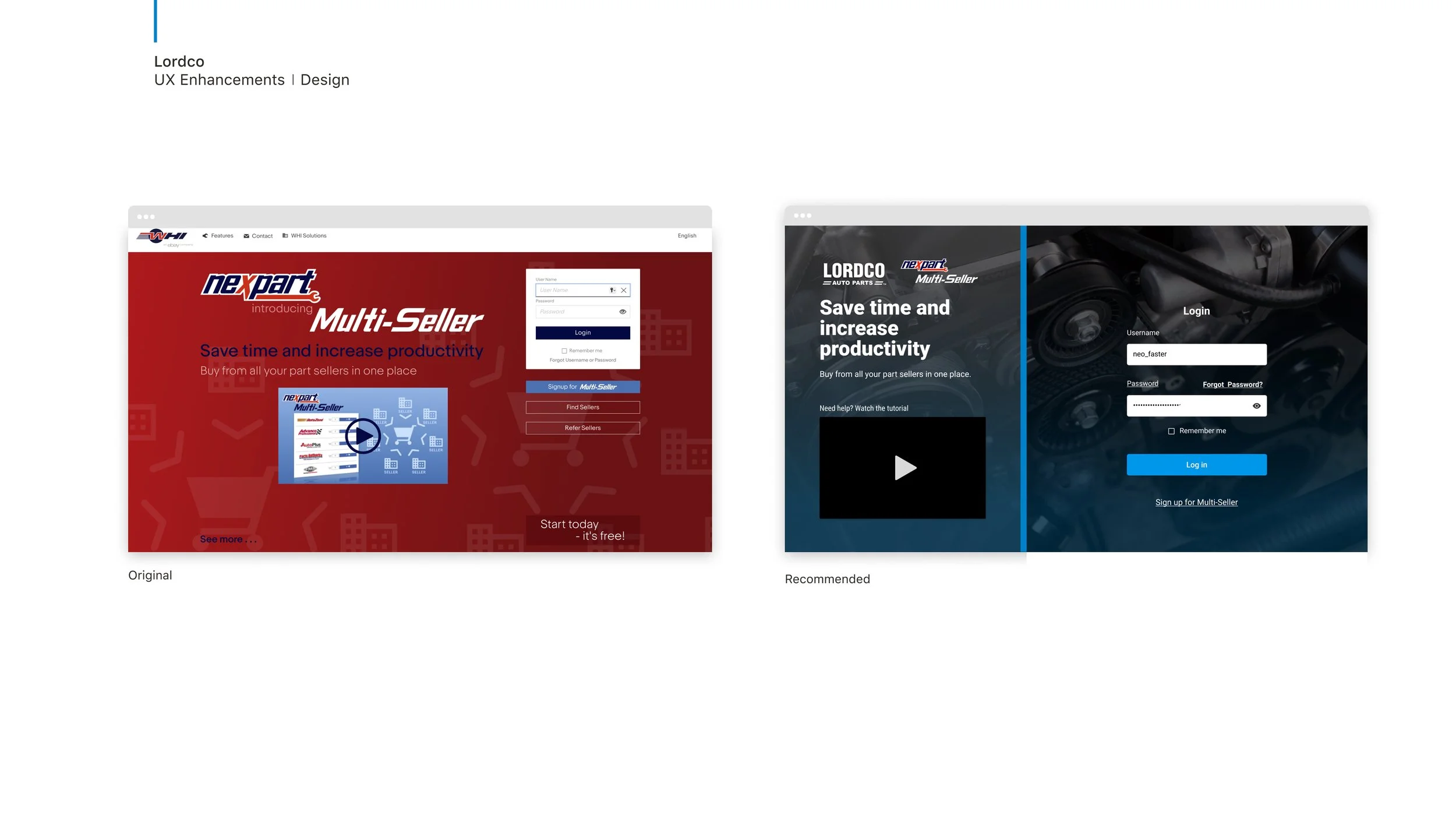
3️⃣ Although the Nexpart onboarding video is helpful for new users the reception with navigating the onboarding UI steps process was cumbersome to read because poor colour contrast and outdated graphics.
We felt the goal for this page is to direct traffic to login and reduce confusion with the multiple CTAs features refocusing them to other sections or hide entirely.
Interviews with store owners and mechanics
Following a series of observation studies with call centre agents there was an pattern emerging regarding the online experience for business owners and mechanics unable to find certain products and getting lost during the sign/login process.


I firmly think that repetition, cooperation, and transparency are important. Rather of holding off on sharing the concept until it was "finished," I made the conscious decision to be as open and collaborative as possible while developing it. I posted weekly updates, ideas, and developments in a company Slack channel that was open to the public for nine weeks. The company was quite excited about this.
I had a short time constraint to deliver each solution for why customers were not completing purchases and leaving checkout flows to call the store.
Getting buy-in from stakeholders to conduct research was difficult at first. The saw it as not as important because it take about a month to prepare and complete analysis. What I assured them was by using by sing what we currently had including to the call centre feedback from 5 customer experience should be enough.
My focus on impact in a very short time, so I based designs based on this feedback in order to before the tradeshow event.
Determining scope and execution
Shop owners want a distraction-free experience because they’re busying serving customers. Fast turnaround is important customer service for cars loves or all ages, plus an increase revenue.
Connecting with customers removed most assumptions. This was a team effort to gather from call centre agents and PM direction was important in following the paths needed for stronger retention in the portal.
Insights
where consumers may look up their preferred brands Lordco has a wide range of reliable brand-name items that are exceptionally well-made and reasonably priced.
Brands page
Following the above observational study customers wanted to see active links, predictive suggestions and filtering features. I worked to iterate a solution that can foster an efficient experience to help them source products quickly.

1️⃣ Search field library lacked advanced and predictive search capabilities rendering users to scroll the large list of products.
A better shopping experience means more customers for Lordco. If mechanics/auto ensthusiats are happy with Lordco, they will bring on clients from other benefits platforms and/or recommend Lordco to clients looking for tools and parts.
Oppurtunities
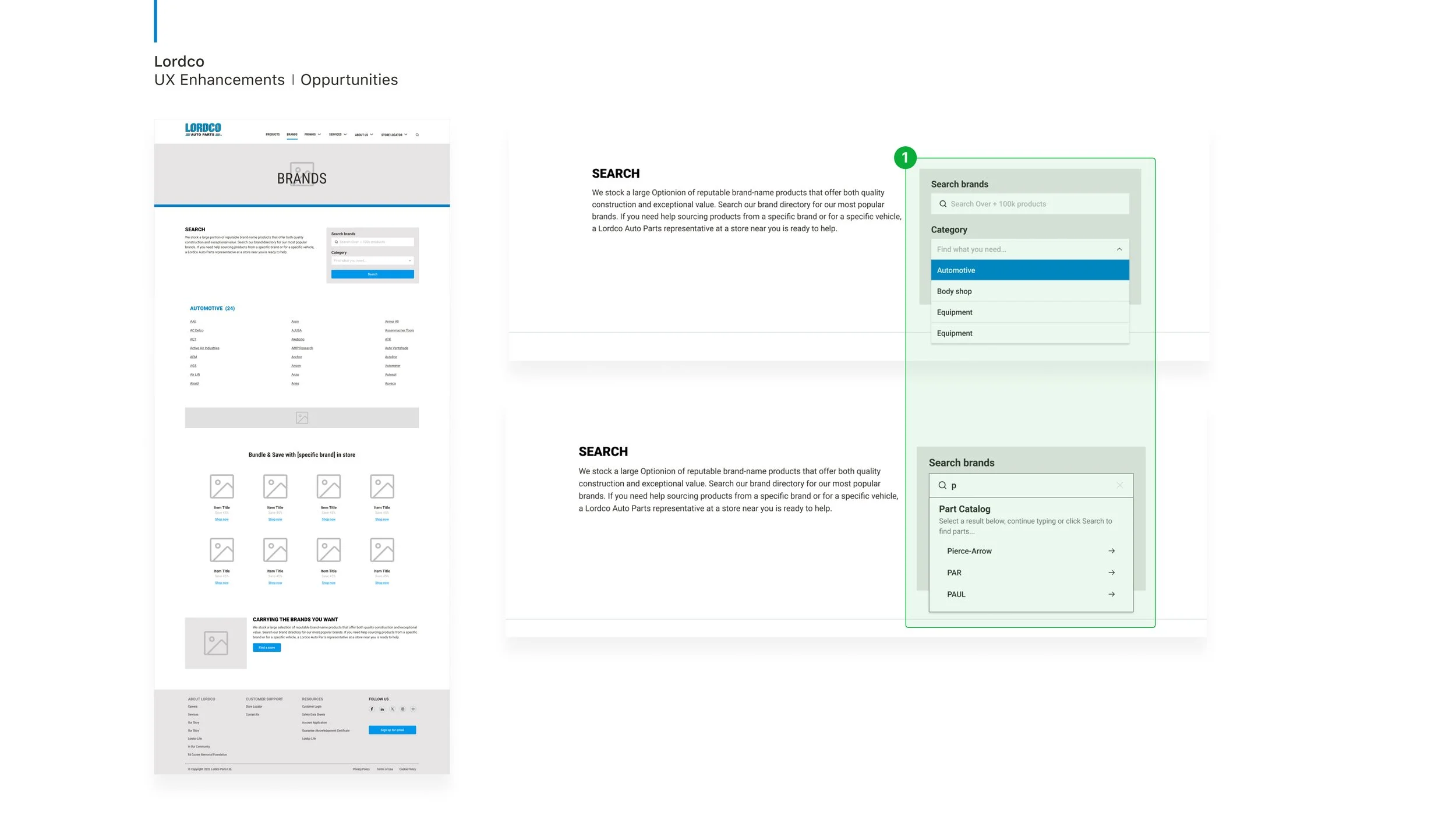
Working with the engineering team while keeping the demands of the company and the consumer in mind led to the solution. The synthesis revealed to us that consumers prefer a list which makes it simple for them to search and locate the brands with which Lordco is affiliated.
Design decisions
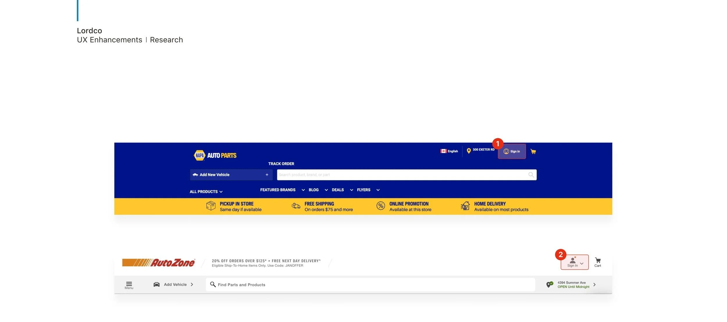
While undertaking a competitive analysis is imperative in comprehending your market status, improving client satisfaction, and propelling strategic expansion.
I wanted to evaluate the advantages and disadvantages of rivals like Canadian Tire, NAPA Auto Parts, and Parts Source Canada, as well as measure performance and spot industry trends that would provide visitors with the content they need for making the right decisions for their vehicles.
Competitive analysis

Canadian Tire is a well-established retail giant in Canada, known for its wide range of automotive and non-automotive products.

NAPA Auto Parts is renowned for catering to both consumers and professional mechanics, offering a comprehensive inventory of auto parts and accessories.

Parts Source Canada specializes in providing auto parts, offering a user-friendly website and strong customer support. While it focuses on a specialized shopping experience, its product range is narrower compared to competitors.
Strengths
Lordco has a one-stop shop the houses most parts in high demand. The portal capacity which gives a substantial advantage over other parts suppliers in the west coast.
Weakness
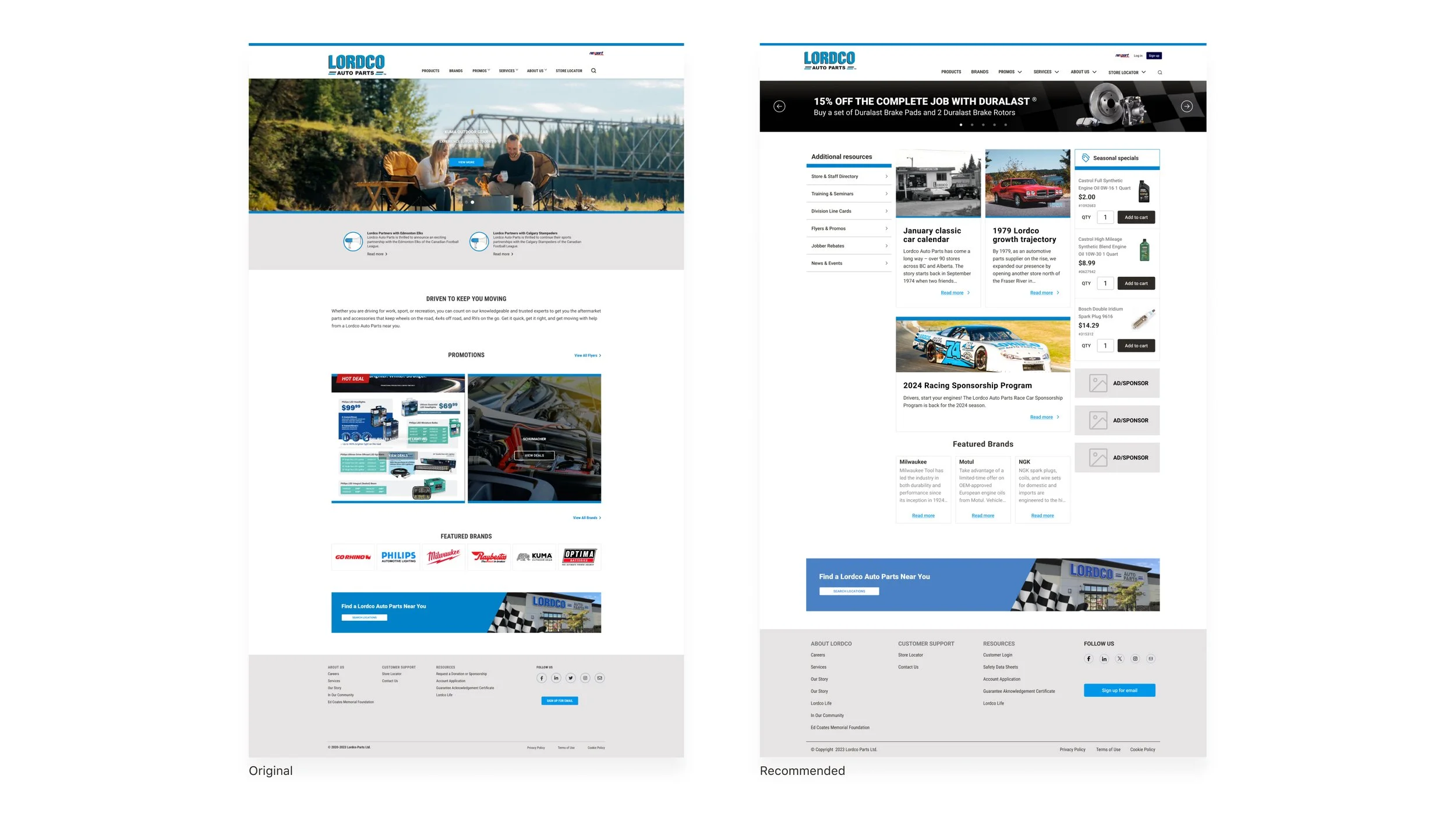
Website content lack customer engagement. Such lack of essentials features like photo galleries, video and social media presence causes withdrawals with better opportunities from other portals.
Oppurtunities
Implementing new features from customers request based on community and call centre comments. For example enhancing search capabilities, better visual design and video/galleries improving a vision of ‘community page’ presence. This impact on the website can better serve user engagement.
Reference: 1️⃣ - 2️⃣
When reviewing the competition in relation to the call centre feedback. It is obvious what customers wanted to see with a login experience. I asked myself why aren’t we making it clear the ‘Nexpart’ portal is a sign in entry point.

A gap remained, even though everyone could see the answer in the product vision and understood the issues with the present experience. How would we travel there? How would we even begin?
There were opportunities to rectify small wins. The first being to help reduce log in confusion. I created a mock up and worked with the PM and development team to implement. Following the understanding I follow through with a series of sprints to improve each feature.
Now what?! How do we get there
Unfortunately, not all of the UI designs were shipped. The main cause was time restrictions in getting the MVP design in place before the annual tradeshow, however I learned about the importance of strategic planning and working closely with PM on a weekly basis in order to ship what is priority for our customers and the business
I'm delighted to present the header (below) navigation UI redesign that was deployed in order to better serve the consumer navigation experience. I collaborated with the engineer and brand designer to develop a captivating menu navigation option that customers would find appealing, as the prior branding on the customer page lacked Lordco's style presence. This helped them navigate the various areas more easily.


The most important takeaway during this platform enhancements is to hold all assumptions until you speak to customers, representatives and conduct your own research.
Working the PM accelerated the roadmap for the customers account portal. Also I took initiative to design high-level screens to guide and accelerate the conversations around plan-build for customers. Although not all features got shipped I believe I took the correct sprints to get stakeholder buy-in early at strategize a plan to enhance user experiences for the auto tradeshow.